C88 Fintech
Building a fintech experience
C88 Financial Technologies is Southeast Asia's largest marketplace for financial services, insurance and investment products with more than 50 million retail customers across several countries.
The company is vertically integrated with over 90 financial institutions and their largest market is Indonesia with millions of potential customers visiting their website each week.
- Timeline
- 7 months
- Role
- User interface design
- Front-end framework
- Client
- C88 Financial Technologies
- Industry
- Fintech

The challenge
Conversion driven redesign
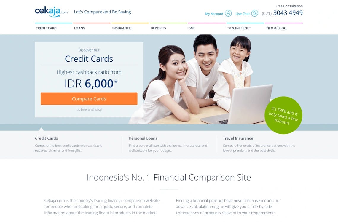
C88 Financial Technologies was scaling fast, and its flagship brands, CekAja (Indonesia) and eCompareMo (Philippines), had become the region’s highest trafficked marketplaces for financial services. But the experience felt inconsistent, a bit dated, and didn’t convert well on mobile, especially across landing and application pages.
With roughly 90% of Southeast Asia going online via mobile devices, the drop off was impossible to ignore. How could we spark more interest in the products, get visitors to take actions, and help them complete the application flow smoothly, even on the smallest screens?
The process
Mobile user experience first
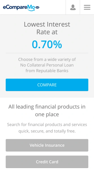
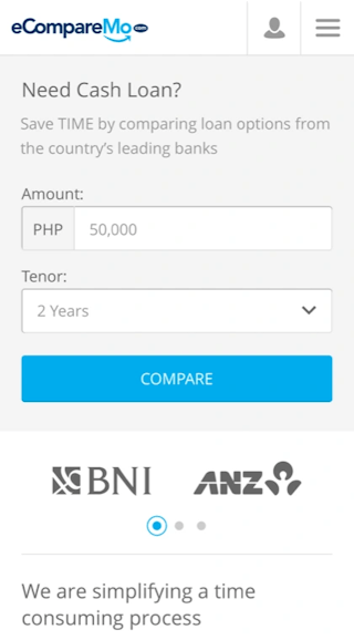
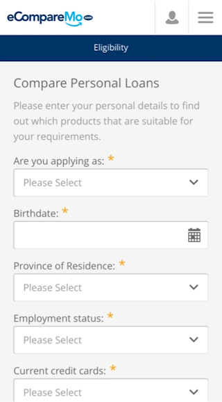
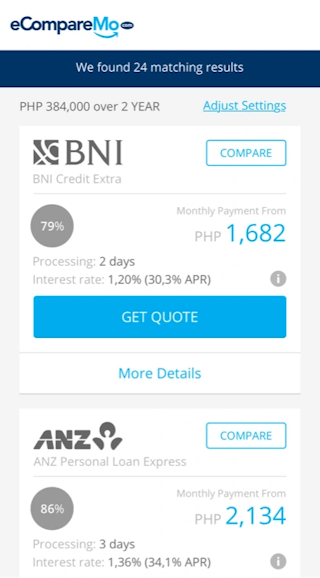
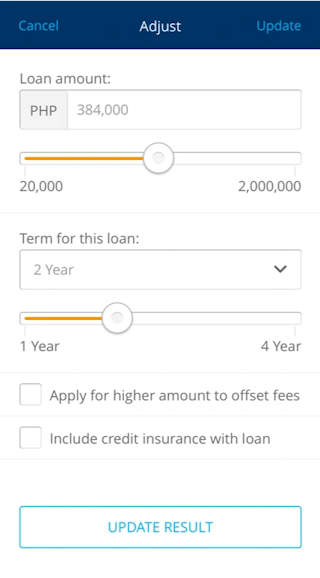
Getting potential customers down the product funnel was the easy part, but we could clearly see that there was an issue the product application process, it wasn't working very well on mobile devices and users seemed lost.
With this in mind, we started our design approach with focusing on improving the application software where a customer do a search, select and finally applies for a financial product.
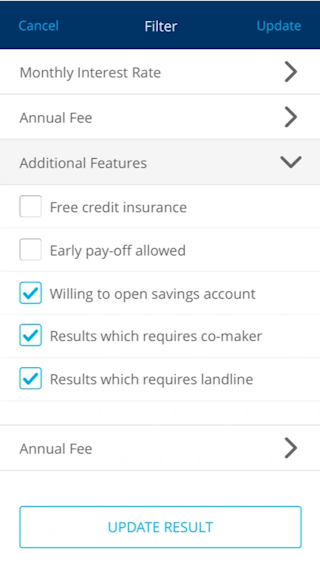
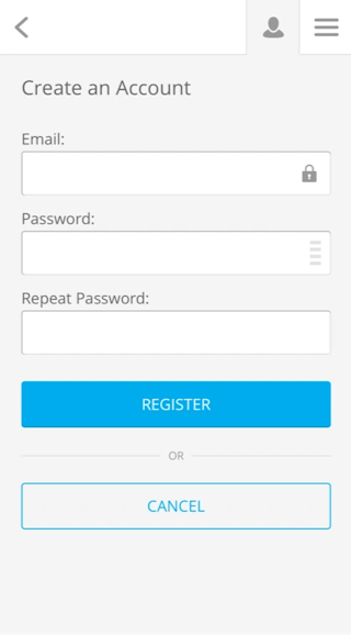
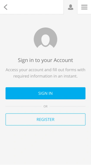
Low fidelity prototyping for mobile devices to test our hypothesis was the clear choice of strategy.
Branding
Keeping it clean and minimalistic
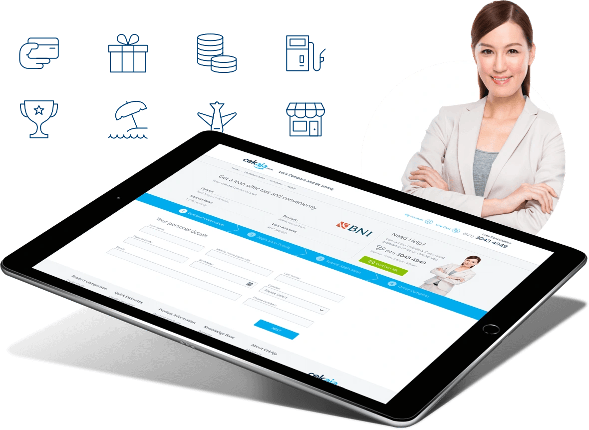
Another challenge we had was the large amount of products and all the different types of sub-services provided on the website, which led us to give each vertical product its own brand and color code.
This allowed us to market each product as a standalone financial asset and we could use colors and educational design elements to lead a consumer through the underlying e-commerce platform.
The portal
Vertical landing pages
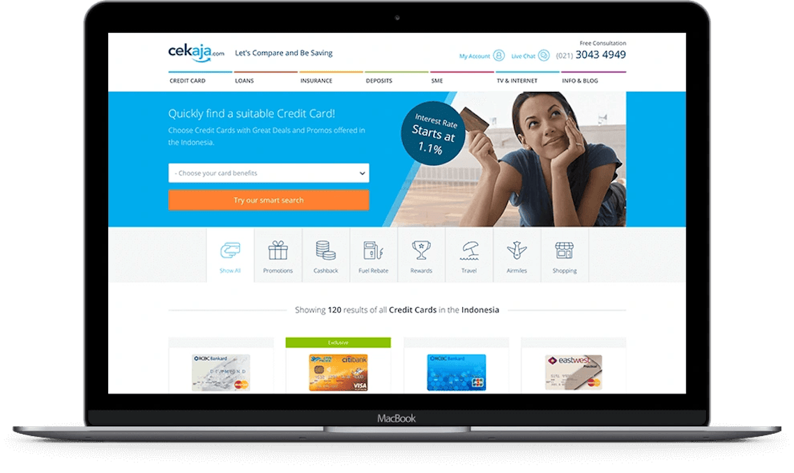
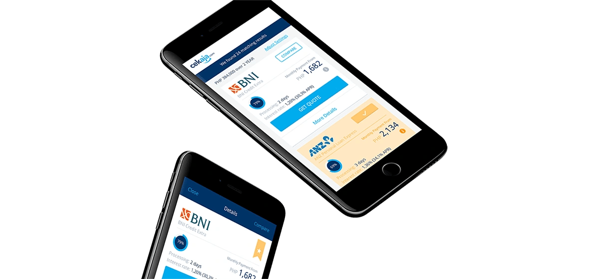
Each product was designed as a standalone vertical financial asset and with the use of landing pages, we could easily guide a consumer down the funnel via promoted advertising and distinct call to actions for each selected category.
With a playful design, we also tried to make otherwise quite boring products more pleasant to browse, select and finally apply for.

User journey
Wizards to minimize complexity
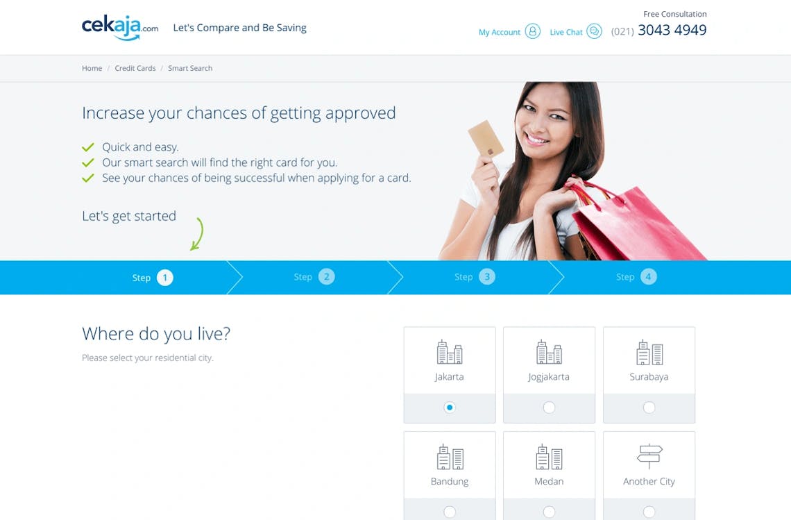
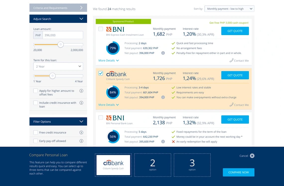
Financial products are a bit more complex than booking a flight or accommodation, as there are several attributes that needs to be met before a customer can apply for a product.
To minimize frictions, complexity and to make sure that the user journey was as pleasant as possible, we built wizards and filters to reduced the required steps in an application process.
The result
Improved user experience
With improved user experience and a simplified user interface, we managed to reduce bounce rates with over 27 percent and we also increased engagement in a more positive net promoter score.
The new redesigned website and an improved content strategy, also increased website traffic with more than 21 percent from organic searches, which led to more processed product applications.
- 86
- HTML Template
- 194
- Font Icons
- 3200
- Lines of SCSS
- 134
- UX Prototypes
